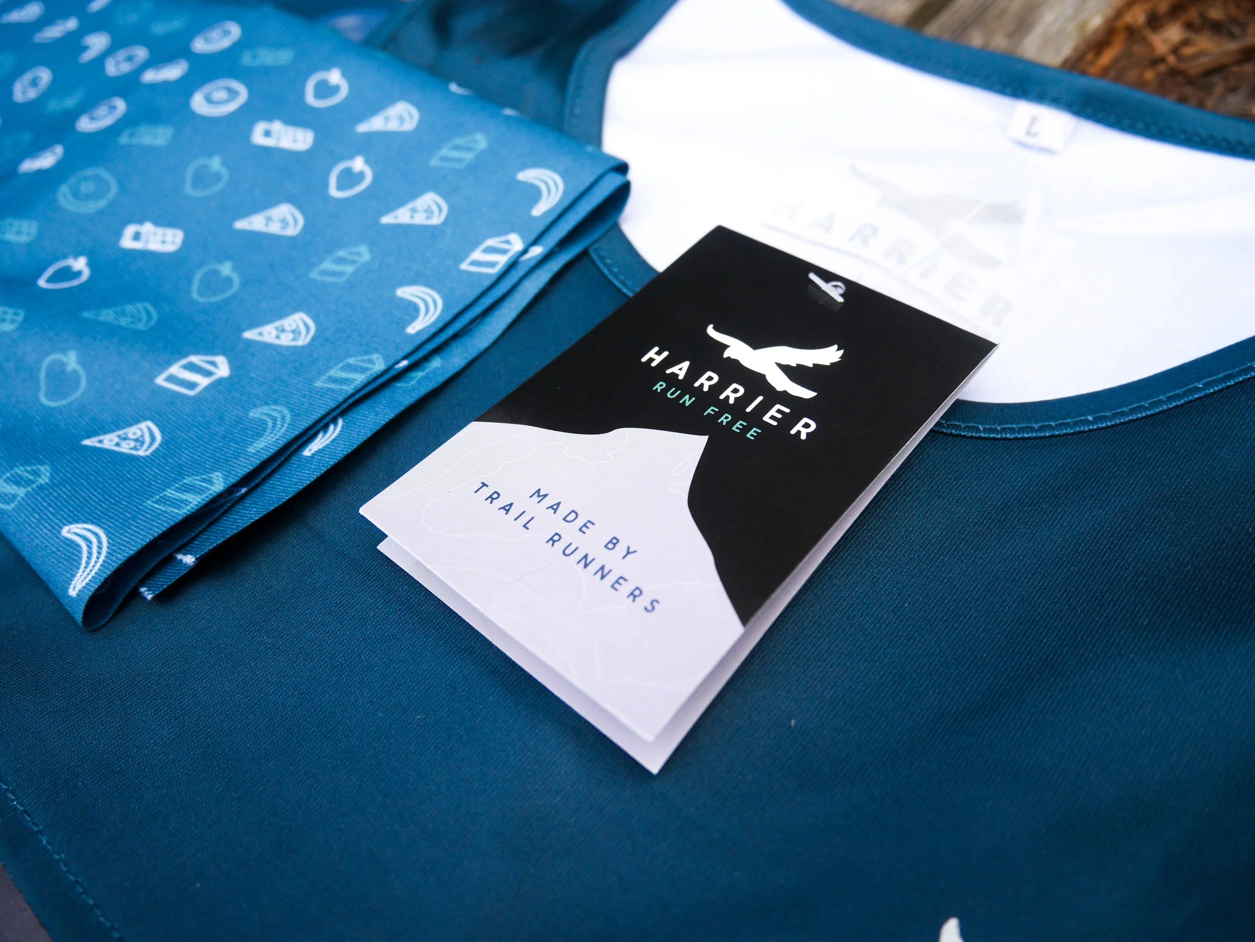
Building a brand around the landscape and community that inspired its inception, for Harrier Trail Running.
Brand Direction | Illustration | Packaging | Print | Art Direction
Harrier Trail Running's founder, Kate Mackenzie approached us when the business was a handful of trail running vest samples, accessories, and fulfilment from her conservatory, but with big dreams and ambitions. Born in the Peak District, Kate wanted Harrier to be an accessible brand created for the existing running community, but with an ambition to invite a whole new audience to fall in love with trail and endurance running.
In the beginning, the Harrier brand was a name, a logo, and a single colour - but with a great story and passionate owner. Meeting up in the Peak District village of Winkle, we started to workshop what Harrier was to become. It needed to be full of life and versatility, it needed to feel 'professional' yet approachable, honest, engaging, and hard-working - a brand that was made of the people who wore it and loved it.
We built the brand out with this all at its heart, creating a palette that had the national park at its roots, with injections of life and inclusivity. We created hand-drawn topography patterns and icons and art direction for the photography which was consistent, yet achievable for a young business and small team. We gave the brand unique typography, that would work just as hard on the web and social platforms, as it would on the products themselves. The whole brand felt as if it was spilling over with opportunity, at the birth of this exciting, new, UK-founded outdoor industry.
Once a brand was established, we continued to work with Harrier to work on product colour-ways, photography, packaging, point of sale, and catalogues as well as supporting the website design.
We were able to support Harrier and equip them with the tools needed to grow their businesses into who they are today.


