A brand and app that puts you in the forefront, with Fore
Naming | Branding | App Design | UX & UI Design
Naming
Fore is a lifestyle app which brings together people based on the data you share with it. Unlike many other similar applications, it uses numbers rather than judgements or preconceptions.
We worked with Fore to firstly create their brand name. The name needed to elude to what the technology did, but not be too literal, or romantic or obvious.
Fore def:
“situated or placed in front.”
This spoke of what the app offered you. It was already putting you ahead of the game, removing all of the ‘noise’ that many other similar pieces of software were pushing. It was also a nod to the fact that the app was ahead of its competitors in its technology and psychology.
Branding
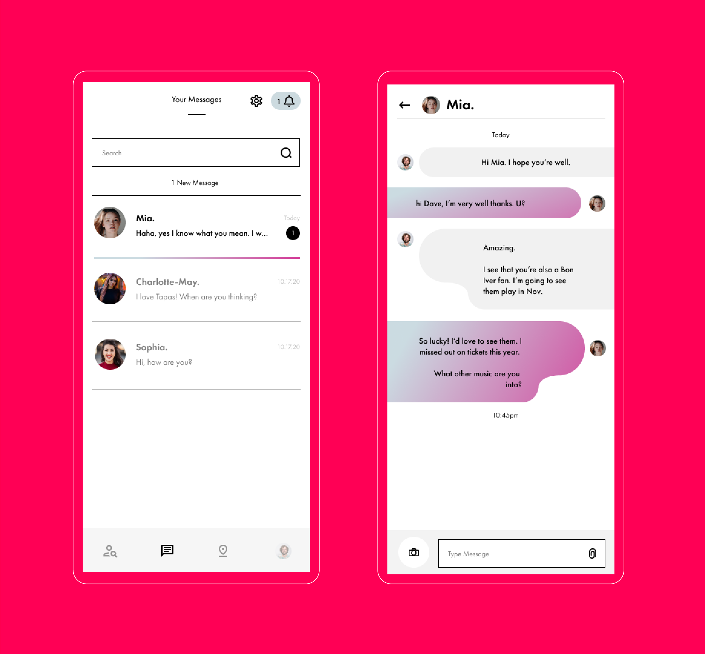
The demographic for the app was Millennials and Gen-Z (18-40 year olds) with more of a lean to the latter. We therefore went for a minimal, stripped back palette with pops of gradient colours, making it feel ‘of the time’ with regards to design trends. Using a modern font, we paired it with simple assets which offered a feeling of ‘new beginnings’ represented in sunrises and sunsets.
App Design
Taking lead from the branding, the app was designed in a similar vein. Fore already had a basic working version of the app, and needed our input for a reskin and update of the UX and UI. We reviewed the existing app, reporting where we felt changes were needed and how, before we then set about starting to design the screens. We wanted the app to feel effortless, clean and almost editorial. We used oversized numbering and pops of colour to lead you to key information and user journeys ensuring the app was a positive and exciting experience.


